
Introduction
When we began to develop Project: New Tomorrow, we knew that we wanted to create an identity that remained timeless whilst also paying homage to the past. We wanted to create something simple yet very effective as well as make something that was artificially produced feel very real. It is my belief that we achieved that and so much more, but in order to fully understand where our brand is today, we must look back.
The Need for a Name
We knew what our mission was going to be, and knew what content we wished to produce and present, but what do we call this thing? After creating and producing branded content for a variety of digital gaming experiences and community projects over the years, I was familiar to the task at hand but stepped foot into a domain I had never attempted before. My previous project had just concluded its run, and we needed a name that celebrated the idea of looking forward whilst remembering what came before.
This name had to encompass not just one aspect of what we do but every single element from our digital experiences to media preservation, and even our Minecraft servers.
It came to us in the form of Project: New Tomorrow, a name that perfectly simplified our mission statement of providing a community platform “By the fans, for the fans.”
Wonderful World of Color
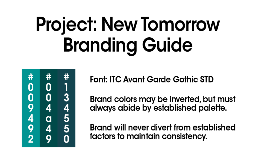
We experimented quite a bit with the branding of Project: New Tomorrow, and our current look did not come overnight. Something that remained consistent throughout this development was the color palette. We wanted something that was visually laid back and provided smooth eye candy.
I have always been fond of the color blue and its many different shades. We chose this color in order to specifically showcase optimism and a casual environment. Three shades of cyan were selected to represent this brand along with white for text and other visual elements, creating a simplistic but visually comforting product.
It is quite fascinating as to how color theory leaves a direct impact as to how we as humans perceive imagery as well as how it affects our emotions.[1]
Creating an Image
Color selection was definitely key to our development in this effort, but creating a visual representation of who we are proved to be the biggest challenge. Like with all of our projects, we did immense research into branding and logo designs of the 1970’s through the late 1980’s. While the colors provided the sleek modern flair to our brand, the logo itself would pay great homage to a period of time when companies and brands began vast experimentation with identity.
Showcased below are the many different concepts that Project: New Tomorrow went through before reaching the final product we know today:
The Final Product
Our final version of the Project: New Tomorrow logo pays tribute to the defunct Rankin/Bass Productions[2] logo, utilizing a custom font originally created by PhantomXD191978[3]. Its bold icons are solid, to the point, and easily recognizable within the media we create and present.
After a months-long journey of experimentation, optimism, and determination, we close a chapter in our story. While this segment of development may have come to a close at Project: New Tomorrow, the stories that this brand will tell will only continue to grow. Cheers to a new tomorrow!
References